GfK Newron – Product feature
Collections
Users weren't spending enough time on the platform. They couldn't find data they'd already worked with. And they weren't collaborating with colleagues who had access to the same information. Three separate problems with a single root cause — the platform had no way to save, organise, or share insights across a session or across a team.
Team
1 x Lead Designer (Me)
1 x Service Designer
1 x Product Manager
1 x UX Researcher
5 x Engineers
My contribution
Desk research
Ideation workshops
User flows
User journey mapping
Prototyping
User interviews
Research analysis
Component design
MVP definition
The problem with memory
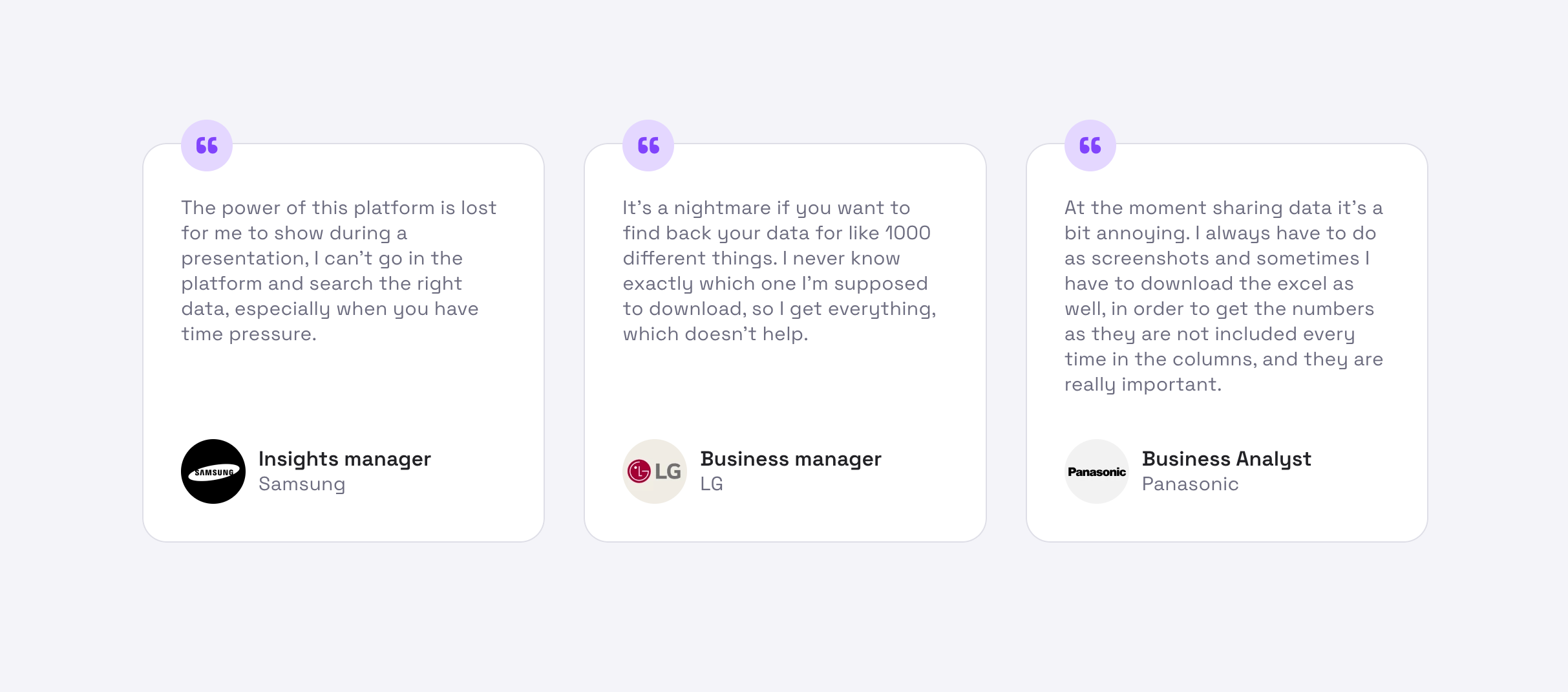
We started with qualitative interviews — talking directly to users across different roles and company types to understand how they actually used the platform day to day. The goal wasn't to validate assumptions. It was to map workflows precisely enough that we could identify where the real friction was.
What came back was consistent: users were losing work. Charts and filters they'd configured before, gone. No way to pick up where they left off, no way to share a view with a colleague without rebuilding it from scratch.
Three ways to use the same product
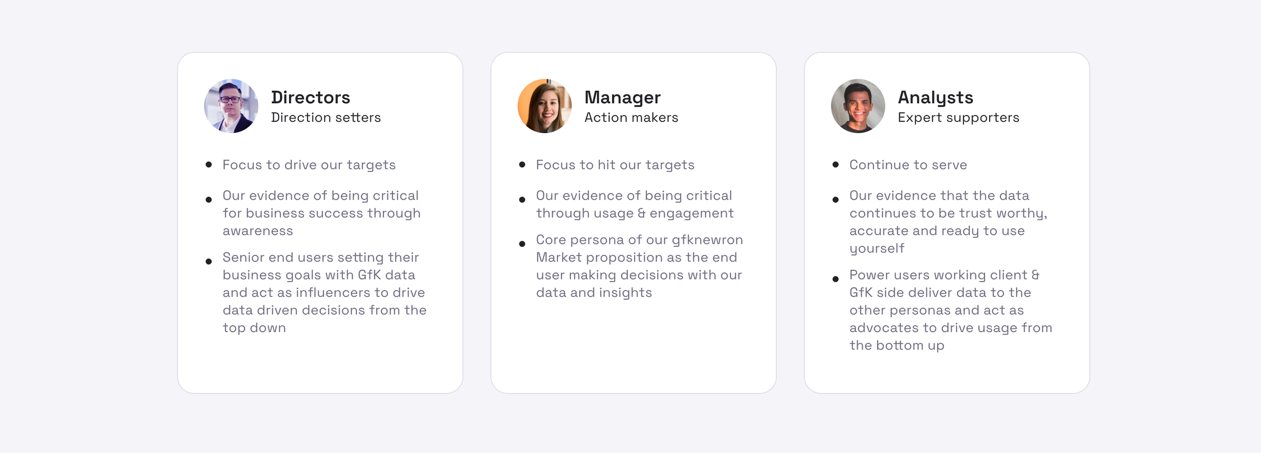
The research surfaced something important, usage varied significantly depending on what role a user held within their organisation. An analyst running daily reports had entirely different needs to a commercial director checking in weekly. I consolidated the findings into three distinct profiles, each with their own primary use cases and friction points, which shaped every subsequent design decision.
Where it breaks
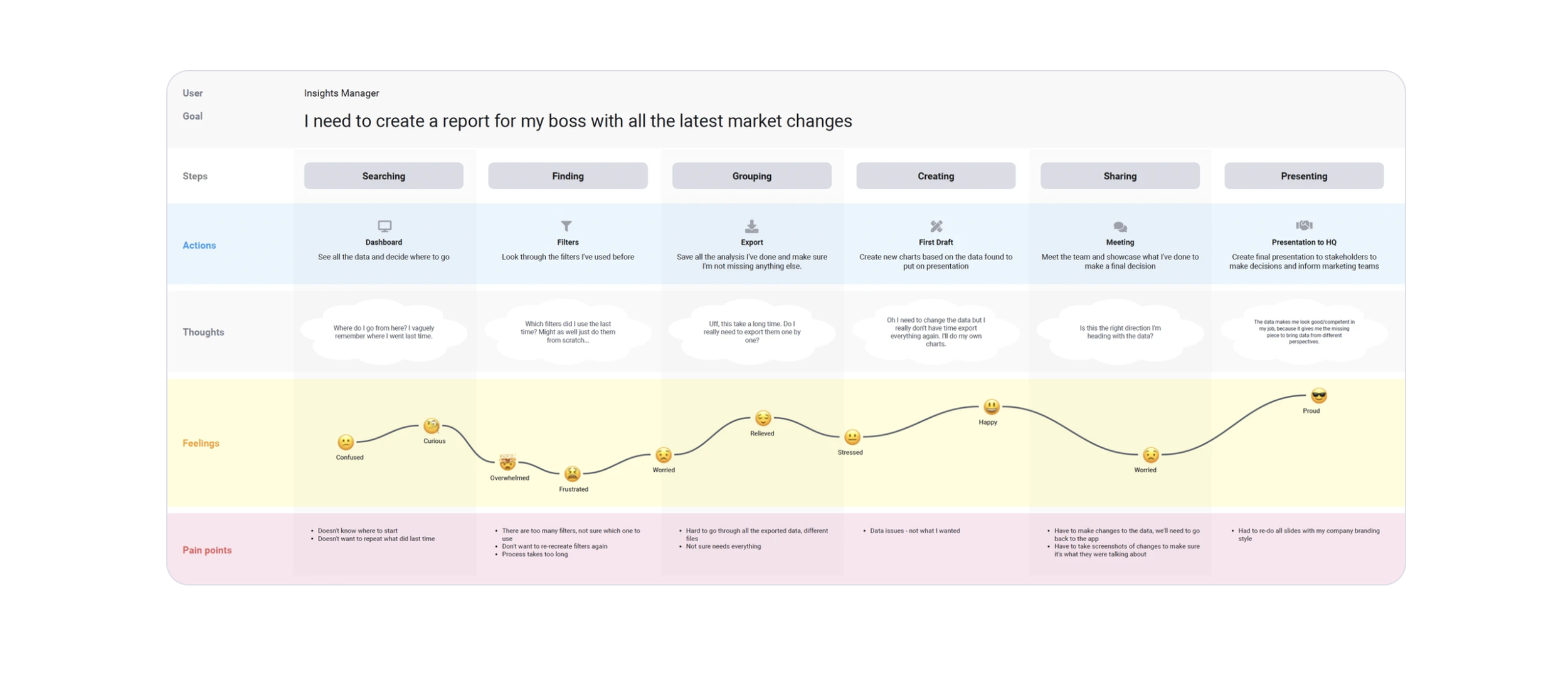
A journey map for each profile, focused on their core tasks. This made the problem concrete — there were specific, identifiable moments in the workflow where users hit a wall. Knowing exactly where the friction lived made it much easier to define what the feature actually needed to do.
From rough to real
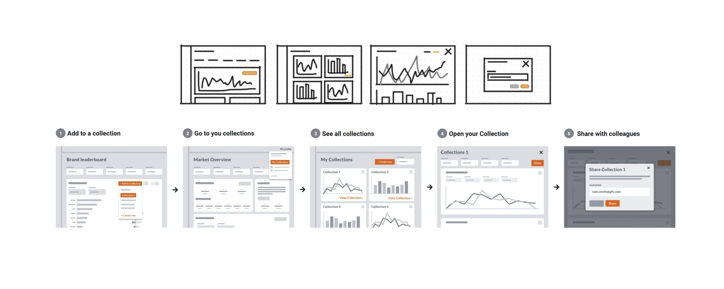
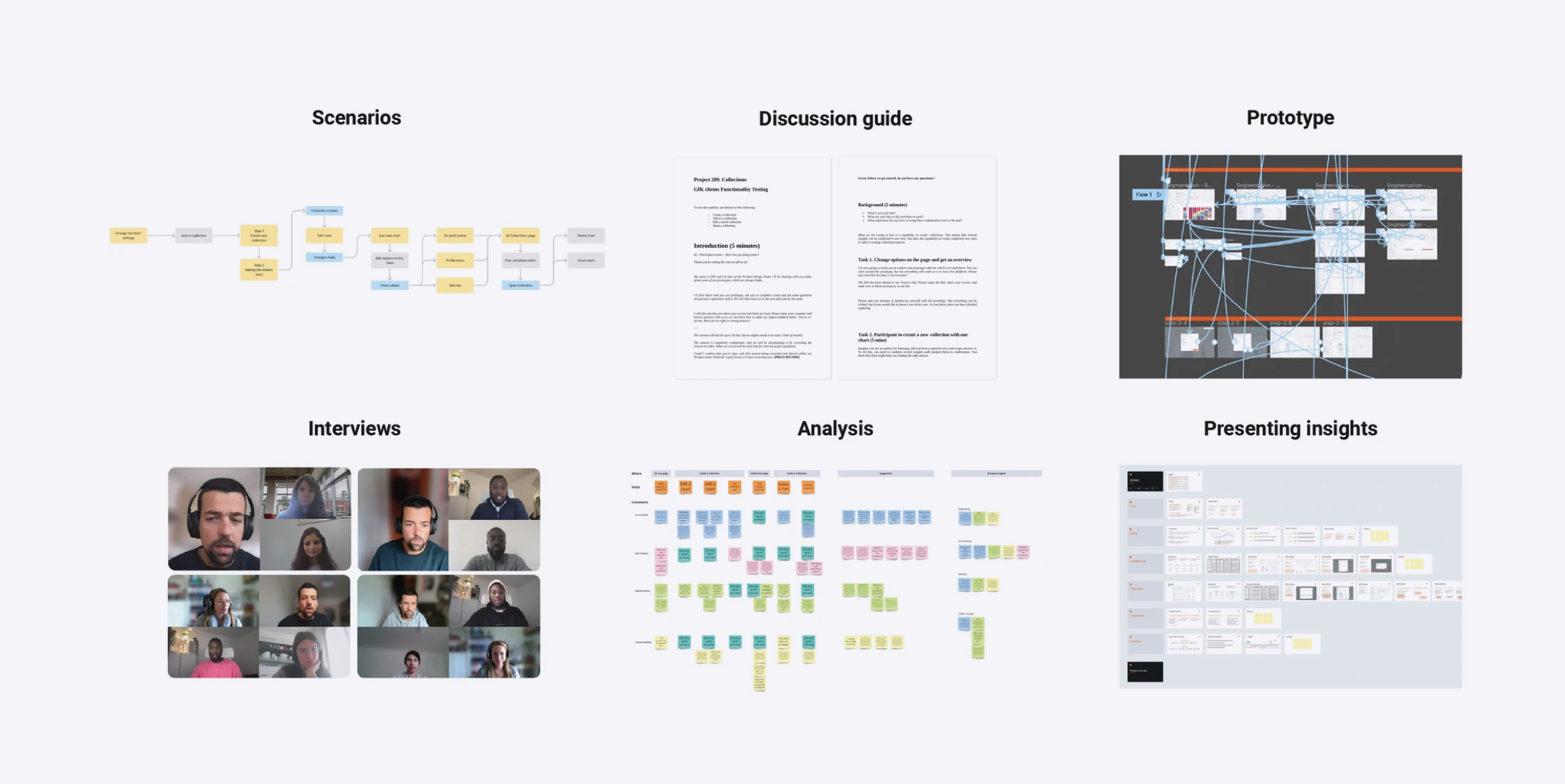
We moved from low to mid-fidelity concepts, working through the range of possible approaches before settling on a direction. Once the prototype was approved by the PM, developers, and stakeholders, we ran two rounds of usability testing — focused specifically on whether users could create collections, add insights to them, and manage what was inside.
The solution
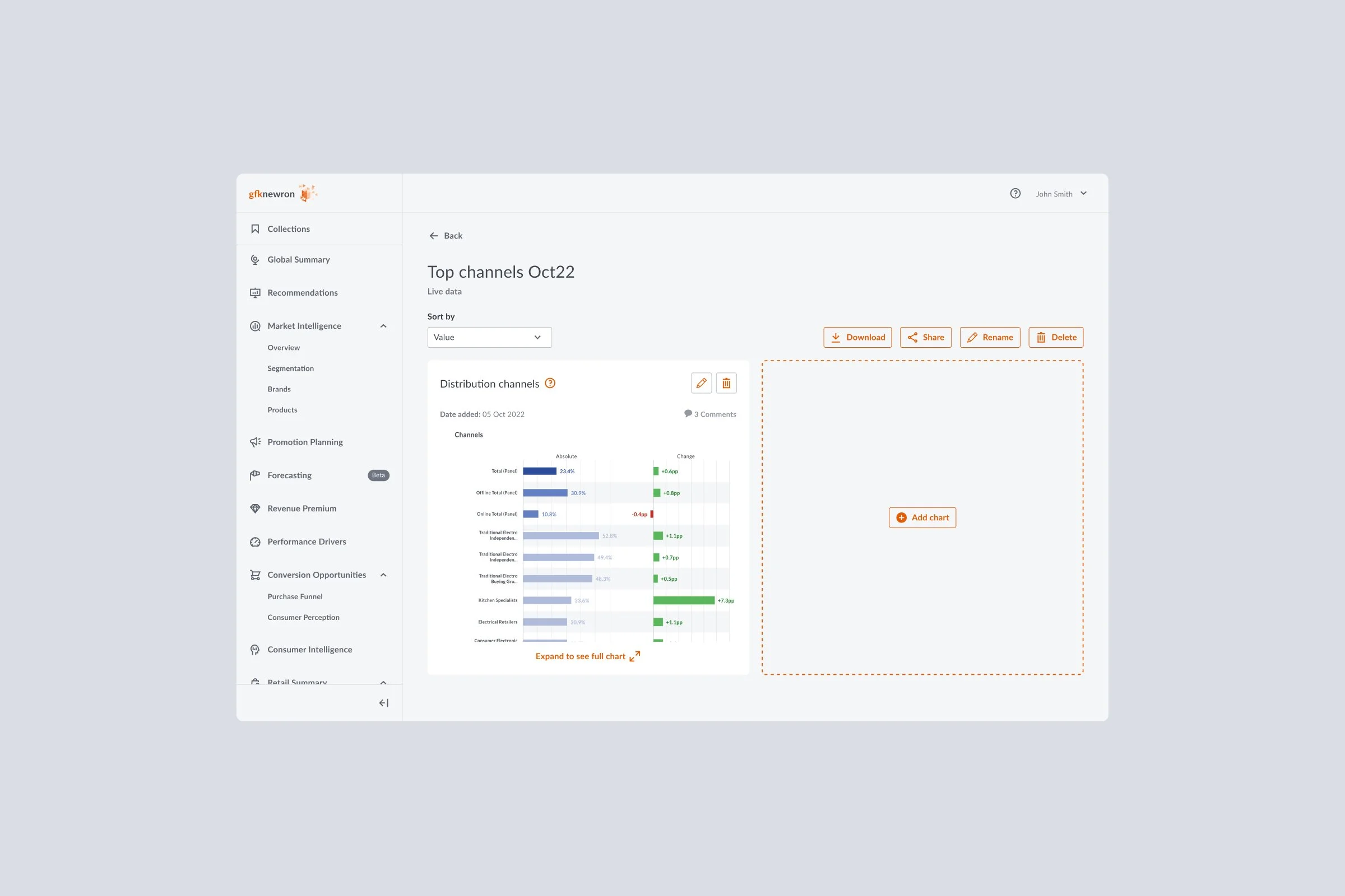
Collections gives users a persistent space to gather insights from anywhere across the platform — charts, filters, data views — into a single organised view. Data can be set to update live or fixed to a specific period. Collections can be shared, edited, and managed collaboratively with colleagues.
Managing collected data
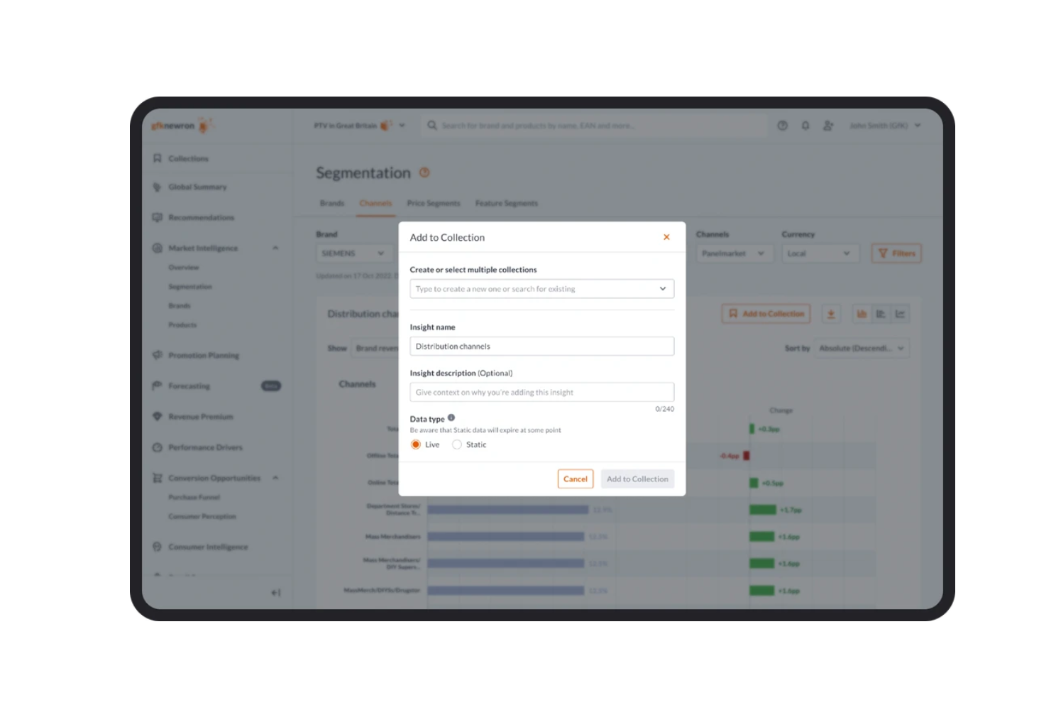
Each insight card displays a live status indicator — a coloured dot showing whether the data is active or inactive. Page settings and descriptions are visible directly on the card, removing the need to open and edit each one just to confirm what's inside.
Adding to collections
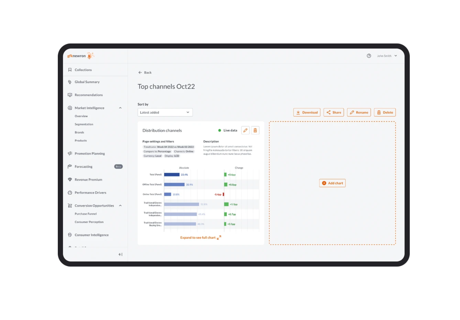
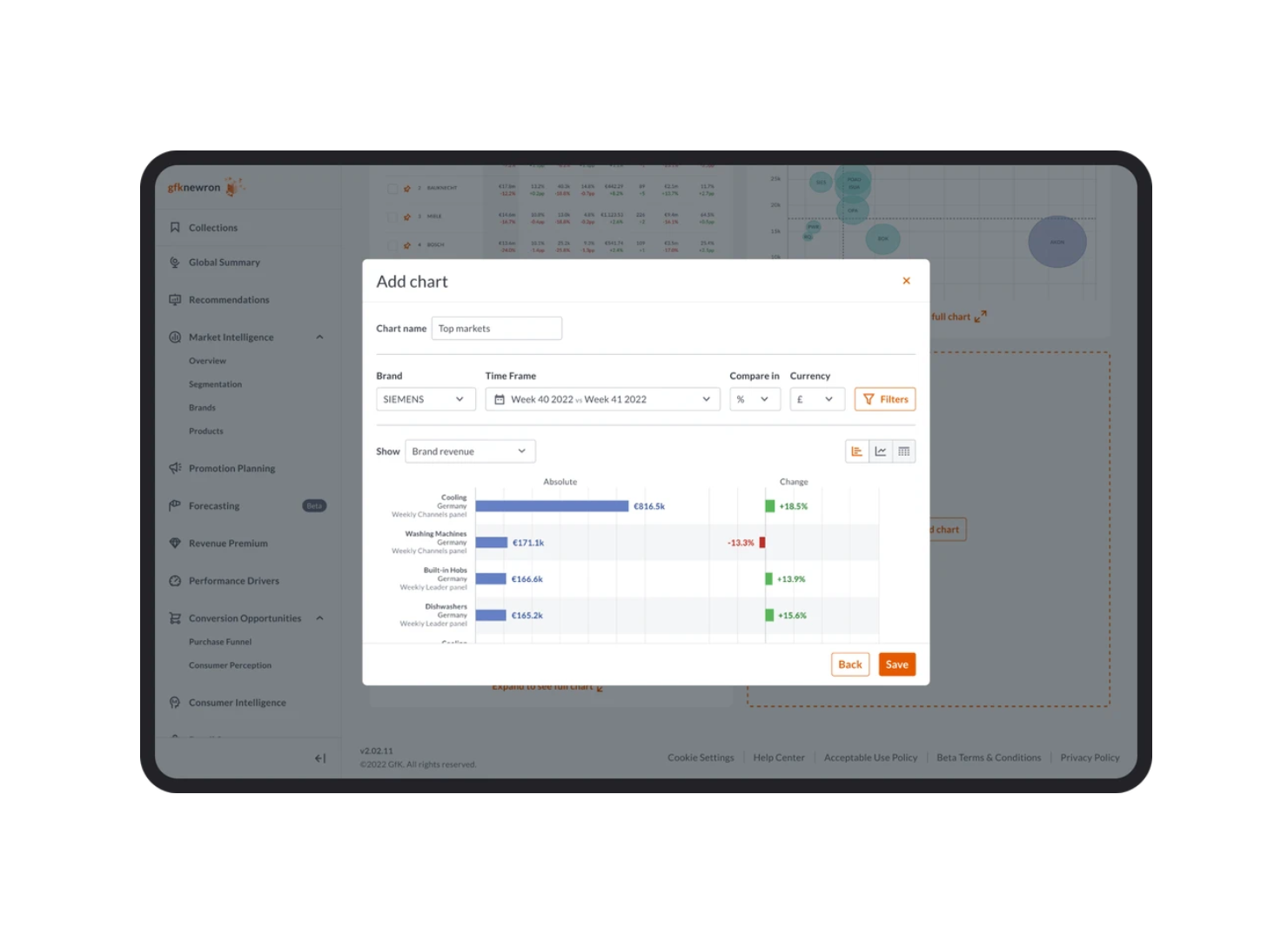
A unified modal handles the entire "add to collections" flow in one place. Users can create a new collection or search for an existing one without leaving the context they're in. Insight-specific data selection reduces confusion when working across different chart types.
Adding insights from anywhere
Insights can be added to a collection directly from within a collection view — the interaction mirrors the standard page experience so the behaviour feels consistent regardless of where you are in the platform.
Results
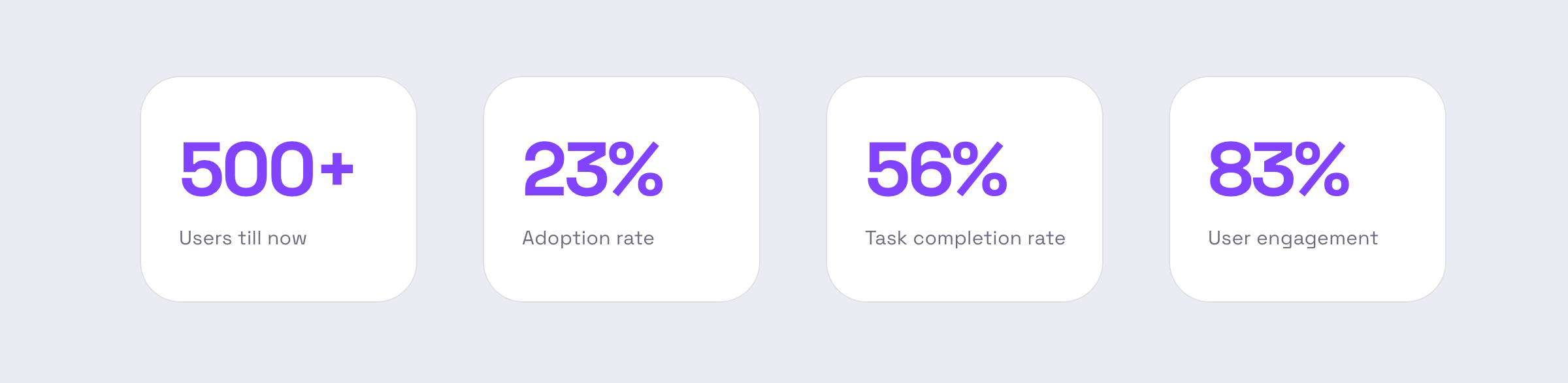
Collections launched in March. The incoming usage data will inform the next iteration — but the core problem it was built to solve was validated thoroughly enough in testing that the direction was clear before it shipped.